Most of our context for how to speak and write comes from watching others’ talks and reading others’ prose. When we’re careful about what we consume, this can be a great way to quickly learn about what communities expect in their communication. However, if we don’t critically evaluate the idioms and patterns we adopt, we can unnecessarily hurt our presentation — and, worse still, can implicitly encourage our audience to adopt these bad habits simply because they’re ubiquitous.
The standard “THANK YOU! ANY QUESTIONS? (WE ARE HIRING 😄)” slide at the end of technology conference presentations is a communication pattern worth examining before you adopt it.1 It doesn’t provide any meaningful information to the audience or, really, do anything other than punctuate the end of a talk — it’s almost just a reminder to the speaker to wrap up. In the rest of this post, you’ll learn a better way to conclude your talks by reinforcing the most important parts of your presentation.
Recapitulate your main points with representative slides
I’m a big fan of using images to re-state the key points or contributions in a slide presentation; I learned this technique from one of Andreas Zeller’s talks and have been more or less creative with it in the past. The basic idea is to take a representative slide image corresponding to each of the main points in a talk and then put each together on a slide, but there are some additional techniques I’ve adopted as part of my workflow. I develop most of my presentations in Apple Keynote, but I believe my advice is generally applicable to other presentation tools.
Here are the four takeaway images I used while concluding my talk at last month’s Berlin Buzzwords, annotated with numbers to show the order of progression:
These slides illustrated four of the main takeaways of my talk; given the theme of the talk, these are in column-major order:
- Because of the way computer memories and storage are organized, if two values are likely to be accessed in succession, they should be stored close together.
- Storing structured data as a sequence of records makes it difficult to execute analytic queries efficiently; in particular, these representations cause query engines to exhibit bad cache behavior.
- Column-oriented formats exhibit better memory system performance than row-oriented formats when supporting analytic query workloads and enable optimizations impacting space and time consumption.
- Apache Parquet is a ubiquitous columnar format that can support sharing data between teams working in different language ecosystems. Because some crucial optimizations are supported by implementation-specific metadata, we need to take some special care to preserve performance while working in polyglot environments.
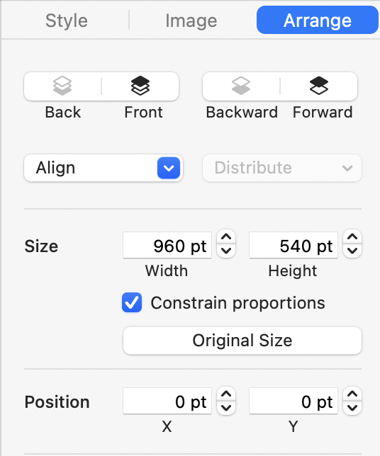
The easiest way to generate these slide miniatures is to copy the representative slides to a new deck, where you can then change the master slide layouts to remove any unnecessary decorations such as organizational logos, conference hashtags, and so on. Once each slide only contains the images you want to use to recall a particular contribution of your work or point of your talk, you can export the deck as a series of full-resolution images. These full-resolution images, when dragged into your deck, will each take up a full slide, so you will need to resize each to ¼ size in order to fit all four on screen at once. In Keynote, this kind of precision resizing is best done by selecting all four images and modifying their size in the “Arrange” tab of the object inspector:
In some cases, your talk won’t have perfectly suitable representative slides and you’ll need to synthesize representative slides by adapting figures or images from slides that were in your talk. You can use a similar workflow for this technique; simply paste the appropriate images into four blank slides in a new deck, export to images, and use the resulting images as above. (For an example that uses figures instead of miniature slides, see this presentation, which I will discuss later in this post.)
Emphasize representative slides with relative transparency
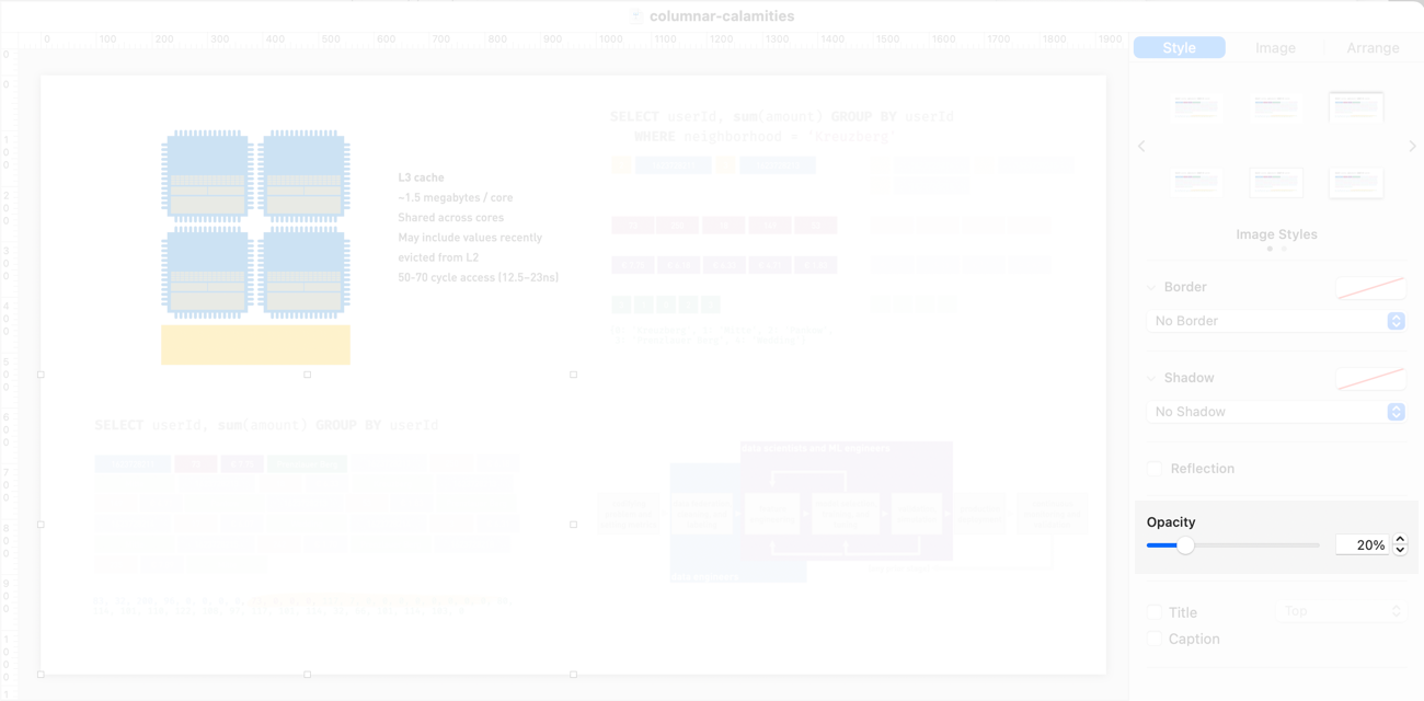
I typically recapitulate contributions in the order they first appeared in the talk, highlighting each one as I present it. There are several ways to emphasize an image; one of my favorites is to reduce the opacity of everything else:
In Keynote, the opacity control is available through the “Style” tab of the object inspector, as shown below; in other tools (notably Google Slides), it may be necessary to create semi-opaque white rectangles to cover deemphasized elements.
Provide context for calls to action
As I write this, it is July 2021 and I haven’t presented professionally in the same room as my audience since early March 2020. But I assume that when we are back to presenting to each other in person more often, audiences will resume photographing slides.2 Ergo, it is useful to provide them something to capture as well as some context so they can rememeber why they took the picture while reviewing a bunch of blurry, inconsistently-exposed captures on the flight home. Instead of just having a single URL on a slide, or a slide-sized citation for a paper, you can provide calls to actions in the context of the images that recapitulate your contributions.
Perhaps you want people to download your open-source project, or read the blog post you wrote that serves as a permanent, handout-format version of your talk. Perhaps you are hiring and want the kind of tasteful, agreeable people who just loved your talk to join your team. By just putting a URL or email address on your final slide, you’re erasing all of the context that your miniature slides provided. If your talk has a long question-and-answer period, your audience might be looking at that bare link for quite a while.
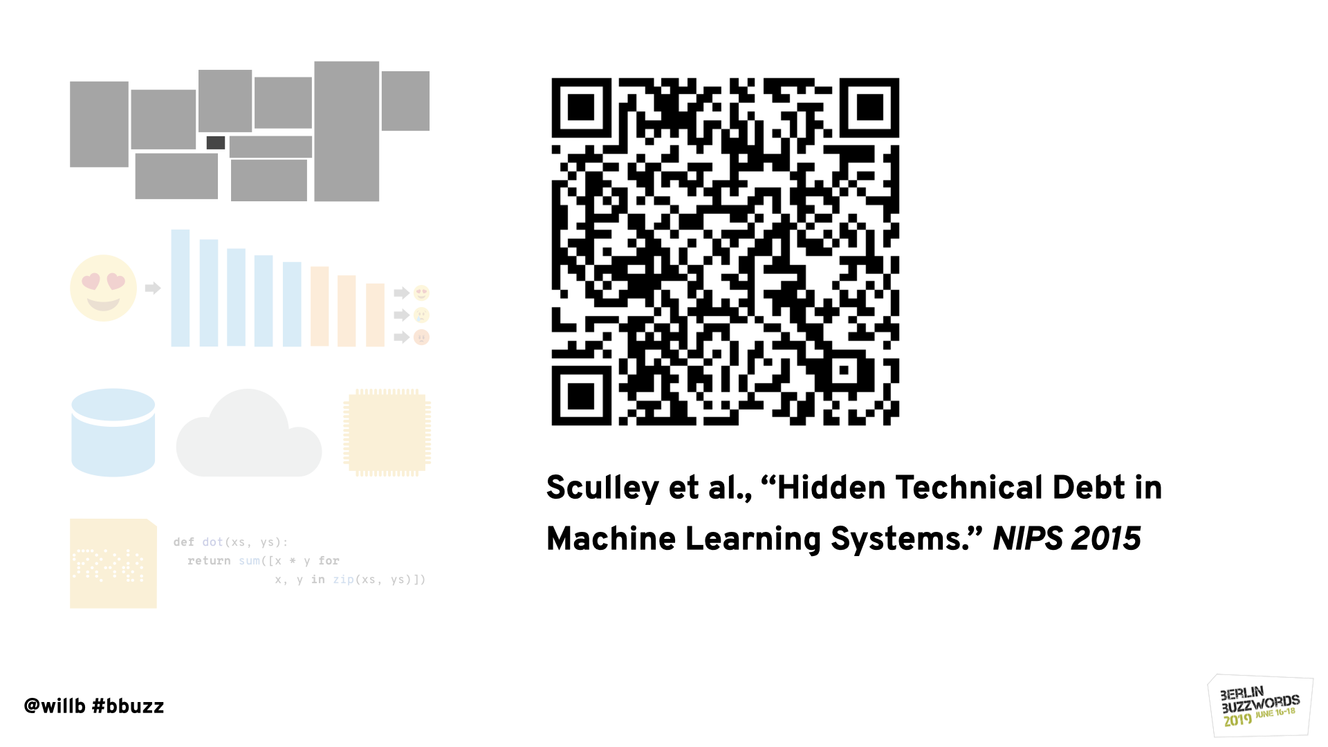
I solve this problem by reducing the slide miniatures to ½ size and aligning them along the left edge of the slide, placing the calls to action on the right. In the case of this year’s Buzzwords talk, my main call to action was to refer attendees to the blog post version of the talk, which served as a handout for the talk and linked to an interactive notebook version of my demo. Here’s the call to action, in the context of the talk’s contributions:
This is actually not ideal – perhaps I should have included more calls to action. But I hope you can agree that it’s far preferable to a slide that just says “THANKS” and has contact information and a URL.
Individual contributions can imply specific calls to action
A variation on this pattern is when you want to include calls to action related to individual contributions.
The talk I gave at Berlin Buzzwords in 2019 was more of an essay about what’s wrong with machine learning systems; the main points identified ways in which we (as practitioners and as an industry) have solved the wrong problems and also some suggestions for how we could redirect our efforts to improve the ways we use machine learning. For some of these points, I wanted to refer the audiences to others’ work that I’d cited; for others, I wanted to encourage people to attend talks that I knew would be excellent and that would be thought-provoking in the context of some of the arguments I’d made.
When I’m citing a paper, I often provide a QR code to a stable link to the full text. Some attendees will take advantage of these and others won’t, but it is very little effort to make it easier for those who will. A QR code alone isn’t enough, though; an attendee who photographs a slide without scanning the code will be left without a convenient way to follow the link. In order to make sure the call to action is useful to the entire audience, I’ll also include a textual citation. (If you adopt this pattern, be sure to spend enough time with the slide projected so that your audience can actually photograph it!)
When I’m calling out talks that I want people to watch, I like to make it as easy as possible for my audience to attend them. In this case, I had the luxury of presenting very early in the conference and so I didn’t need to tell people to wait for videos to be online. I had called out each of these talks at a relevant point in the body of my talk; the slide above shows how I mentioned them again in the context of reviewing my main points. I took all of the information in the official conference program, including time, date, location, and title; I also provided a verbal precis of each talk to let the audience know what to expect. I include speakers’ headshots not just because my fellow speakers have such high-quality portraits, but also to make the call to action personal and encourage hallway track discussion.
Next steps
In this post, you’ve learned some effective ways to remind your audience of the main contributions of your talk and inspire your audience to take action. If you adopt any of these techniques, your audiences will retain more of your work, remember your talk more fondly, and have some useful ways to build on what you’ve done. Most of all, you’ll be able to put your excellent work in the best possible light and not tarnish it with a content-free conclusion.
Thanks to Isabel Zimmermann (who also had an excellent talk at Berlin Buzzwords this year) for encouraging me to write about this topic.
Footnotes
While I generally thank audiences when concluding a talk because attention is precious and good questions are rare, I’ve recently become more sympathetic to Patrick Henry Winston’s argument that ending a talk with “thank you,” even verbally, diminshes the value of your work by implying that your audience has had to endure your presentation.↩︎
This was inexplicable to me for years but I have stopped trying to understand it and now accept it as an axiom of human nature.↩︎


